On our previous post, Big Dog Wraps shared some basic information regarding typography and typefaces. We also reviewed how typefaces can be grouped and classified, in order to have a better idea when and where to apply them.
Today, continuing with the subject we would like to share some basic elements to be considered before, choosing and applying a typeface. Even though there isn’t any strict rule to follow, with understanding, practice, and intuition you will get good results.
Applying the Correct Typeface
Most of the time, one typeface will do, especially if it’s one of those wild cards with many different weights that work together. Nonetheless, if necessary we can come up with interesting combinations.
Combining Typefaces
Expert designers suggest when mixing two different typefaces, either to keep it exactly the same, or change it a lot. When we combine multiple typefaces on a design, we want them to coexist comfortably — we don’t want to distract the viewer.
Often, two typefaces work well together if they have one thing in common, but are otherwise greatly different. This aspect can be visual, like a stroke weight or it can be chronological, like the same period of time.
Try to keep in mind the typeface’s group family or classification and see if you can come up with some interesting combinations that work for your project.
Mood
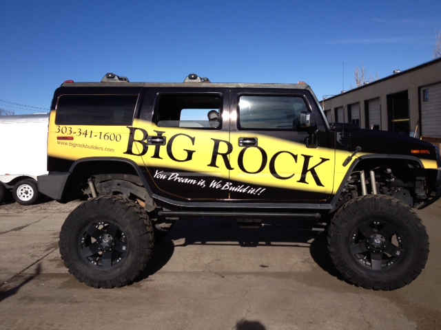
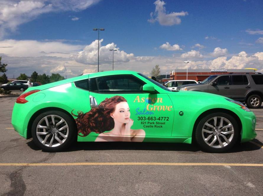
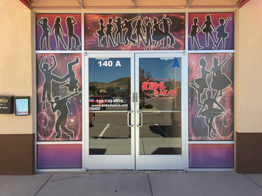
The mood of a typeface is an important aspect of how it should be used. Different typefaces have strikingly different moods. Commonly used moods include formal vs. informal, modern vs classic/traditional, and light vs dramatic. Some typefaces have very distinct moods.
Some typefaces are more transcendent and can convey almost any mood based on the content and the other typefaces they’re combined with. For example “Display Typefaces”.
The mood is a vital element to contemplate because it should represent what your business is all about. Think if your business is formal, informal, fresh, elegant, modern, easy-going, dynamic or solemn.
Send the Message
In the end, there is no secret formula when picking a typeface, it’s more a matter of taste, knowledge, practice, and intuition. However, if you are still having problems selecting the correct typeface for your business designs, call the experts in Colorado.
At Big Dog Wraps we create unique corporate designs for business vehicle fleets and spread the word about your enterprise, products, and services all over the US. Our roots are in providing our customers with excellent marketing and advertising solutions.
We can help you choose the correct typeface the best suits your business corporate image and print it on a vehicle wrap, window graphic or banner. We are your source for creative, unique, wrap and graphic solutions.
Give us a call today and get a free quote on your project. Our complete dedication to the success of your business is what makes us different.


